
One of the most amazing things in Design Factory is the possibility to bring your skills into the projects and at the same time learn from the other fields and processes on the way. Bringing together students from different fields is like putting together puzzle pieces. More the pieces the better the picture, and in this case better the knowledge of the product journey. With Markku, we wanted to try the teaching process of the laser corner from the business student’s perspective who has no previous experience from the machine.
Starting the process
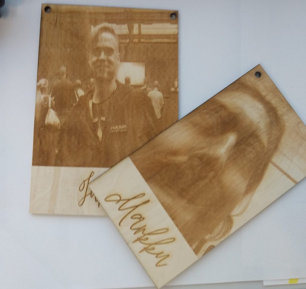
Because I’m a business student I don’t have much experience in the designing process. I chose the photos that I wanted and opened the photo in Adobe illustrator in .PNG form. Photo and text had a white background, so I started at cropping the background away. So that there’s only the photo and a text left. Since it’s possible to also cut with the laser, I added circles to the corners of the photo for the holes.
Adjusting the settings
We are using leftover pieces so it’s important to make the settings right that the laser hits to the right places. First I measure the piece and adjust the size of the photo to match that. Most attention is needed in the printing settings. In the printing settings, I fixed the photo to the left corner where the piece is going to be in the laser and continued to preferences. We have a notebook where laser users have written down the settings they have used in different materials so you can always look there when in doubt. Remember to choose vector (for cutting) or raster (for carving) or both depending on what you want to do. We chose the following settings:
Vector: Speed 10%, Power 35%, and Freq. 10%
Raster: 25%, Power 8%, and Freq: can’t be changed
Resolution: 300
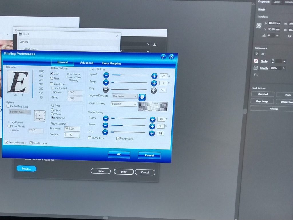
First lasering came out pretty well but we noticed that these settings weren’t the best for all the photos because of the lighting differences. We lift the resolution in the printing settings to get better quality for printing. For the rest of the pieces we used:
Vector: Speed 10%, Power 35%, and Freq. 10%
Raster: 25%, Power 9%, and Freq: can’t be changed
Resolution: 600
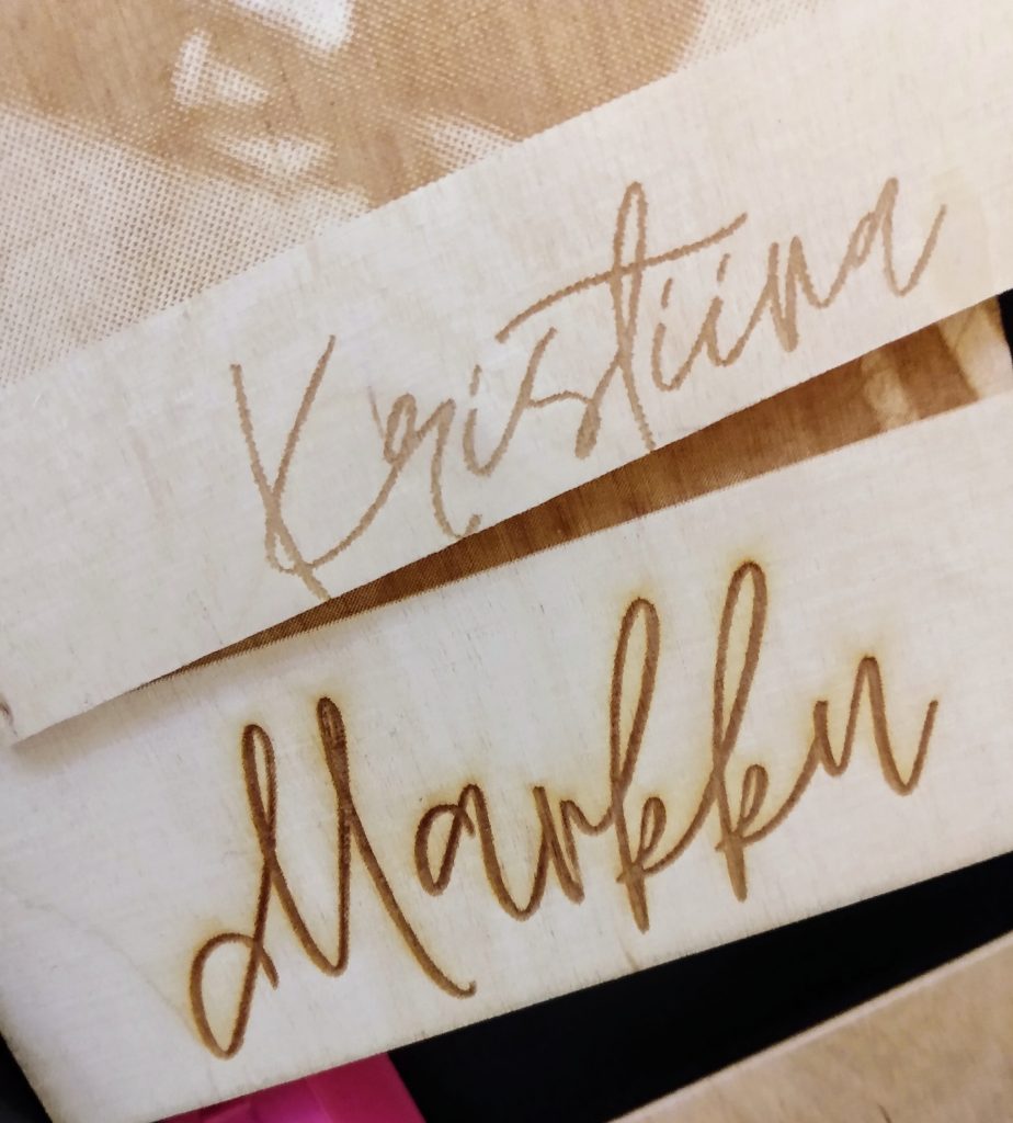
So, we raised the resolution from 300 to 600 and lifted the raster power from 8% to 9%. It’s important to adjust the power very carefully so that the plywood doesn’t burn too much and cause any problems. The difference is quite clear. The Kristiina text is before the changes and the Markku text is after the changes. When we adjust the power the laser burnt a shadow to the text and the text is obviously much darker. Also, the pixels are more noticeable in the Kristiina text so when we raised the resolution the lines came out smoother and better.
About the learning process
We spent the morning in the laser corner and I only had the photos with me when I went there. I would say that the most time-consuming part is the adjustments in the Adobe Illustrator. They are not hard but there are a few steps that need to be done before the lasering. The basic rule is that the laser burns all the other shades in the photo but the whites. So if you have a white area, like I had behind the text, the laser won’t touch it.
But In the end, I was surprised how easy the steps are for basic lasering. I was so sure that I wouldn’t remember a thing at the end, but I think that I did a pretty good job. Taking into consideration that I’m just a business student who has no previous experience from the machine or anything like that. The best part of it is that you don’t have to be a student from any specific field or must have any skills beforehand that you can learn to use the machine. You just need proper training from the DF staff. It’s all about trying and learning from your experiments.


