First-ever HAMK Design Factory PDP ended in May and it was quite a ride. We began our own PDP experience with little planning and planned the next weeks’ content in fast plan sprints. The course was a huge learning process and not an easy ride we would say.
We started the PDP (Product Development Project) in January where we had approximately 50 students starting the course. We had students from healthcare, construction engineering, mechanical engineering, and business administration. Projects were from:
- Riihikoti, who wanted to know what kind of problems the staff faced during the working days and make the medical distribution more staff friendly
- RoboRiksu wanted to make medication transportation more functional
- New Ahvenisto ASSI hospital wanted to make the transition from the old hospital building to the new as staff friendly as possible and know how to make the hospital’s customer experience friendly
- and K-HKS (Kanta-Häme central hospital) wanted to make the ER waiting area more customer-friendly.
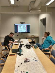 HAMK’s semester is divided into four periods, where normally all the courses are built to last for one period, which is 15 ects. This was a slight, well not a problem, but something we needed to figure out since the Aalto PDP lasts for 9 months, which is around three periods. We thought that one period is not long enough but then again three might be a bit too long. So, we ended up meeting in the middle and chose two periods. On the first PDP, we wanted to make sure that all the students who wanted, could join the course. Because of that, we split the course into two sprints, meaning that there was a possibility to jump on but also off on the halfway point, which naturally also meant half the credits. Everything started quite well in January and we gathered together every Tuesday with the students. On a second meeting the teams were built, and everyone got to choose which project they wanted to be part of. We ended up “losing” some of the students on the halfway point, but we also gained new students, and all in all, we had about 30 students on board for the second sprint. Depending on the team’s situation, the team either continued the project with the old crew, which they had from the beginning, got some new staff members or lose some members. If the team was completely new they got to choose if they wanted to continue the old project or start from scratch.
Soon we (DF staff) noticed that we might have too many moving parts on the course. For example, the teams were changing because of th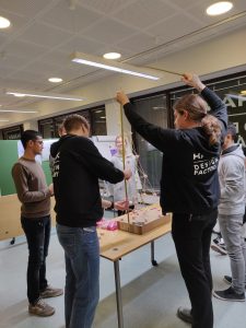 e two sprints structure and since this was the first-ever PDP we didn’t know everything that’s going to happen. Things were changing on the way and we needed to readjust many things. After the first period, we thought that now we might have an idea on how to bring this to an end but of course life doesn’t work that way. The COVID-19 quarantine changed everything. Suddenly we needed to turn everything online, which needed quite a lot more work since we had designed everything around the meetings, where we can work in the DF facilities. The biggest struggle was to figure out, how in the world we can make everything remotely accessible since the main point of the PDP experience is to build a real-life and movable prototype. The struggle was real. Well, we had no choice but to turn everything around. We say that we are a flexible working environment in which specialty is fast experiments, and this was one big fast experiment for us.
We moved all the action to Microsoft Teams including the workshops we could provide remotely. It was not an easy process and it needed a lot of communication so that we could help the students as efficiently as possible. We moved the final gala to the Glue VR platform, which ended up working, well ok, but not in a way we wished. We have to admit that after the PDP, we were all exhausted but happy that we survived. The next PDP is under construction and we have a good idea of how we are going to build it.
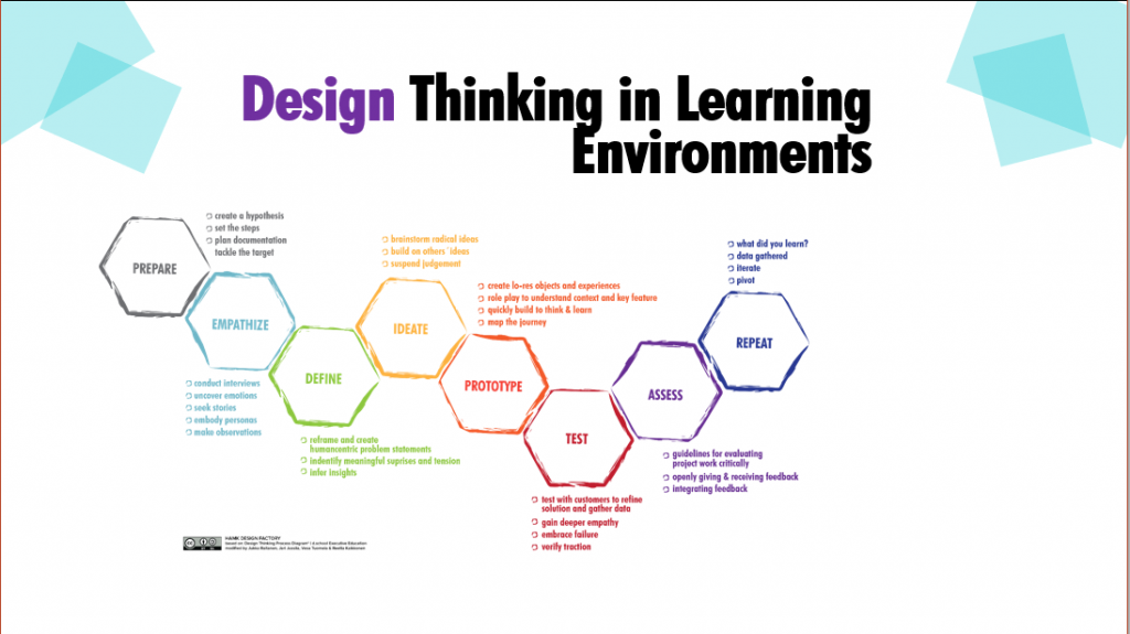
PDP 21 SNEAK PEEK!
All the projects:
ASSI HOSPITAL
1#
Assi hospital: Cost 369,5 million €, 1900 workers about, and 415 hospital beds. Constructions will be started in August 2020 and it’s estimated to be completed by 2025, when the new hospital will be the 10th largest central hospital in Finland.
Need: Assi’s main objective is to create a uniquely customer-oriented, high standard hospital with excellent accessibility from everywhere in Southern Finland. Assi will be working in close co-operation with the regional special health care, primary health care, and social care, as well as with university hospitals and private service providers. The use of innovative technology and digital services will provide modern, comprehensive and safe treatment for their patients.
Request: What kind of staff improve the humane concept and encourage the client’s collaboration? What kind of solutions could be used to improve the humane concept through digital processes? Could the humane concept be built with the information from a leader’s perspective or background?
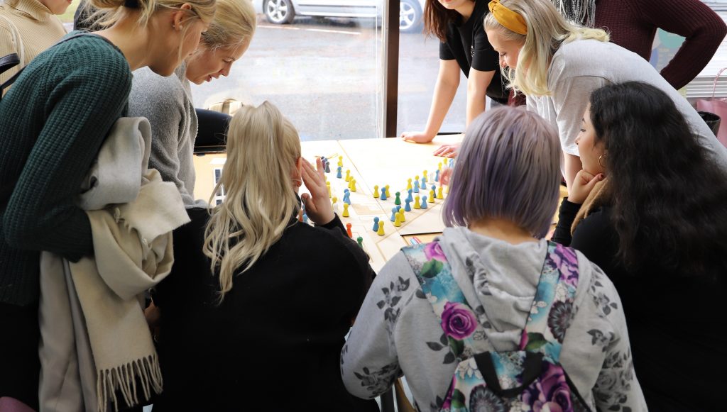
Students discovered that the hospital staff feels uncertain about moving into the new hospital. So they wanted to make the move more humane for the staff. The team wanted to develop the well-being of the staff by reducing their fears of the new environment and habits. Keeping that in mind the students came up with an idea of the game board from the new floorplan. This way the staff could visually see how and where the staff and patients will locate. Team colored the pieces into ten groups. Each group represents different staff member groups like doctors and nurses. The hospital got excited and the team continued to develop the idea in the sprint 2.
2#
Need: The started idea for the new Assi hospital plan, has been to build the world’s most humane hospital. The goal is to create a high-end healthcare system, which would be located in Hämeenlinna. This would also meet the requirements of healthcare in the future.
Request: How will the Assi hospital concept work for the customers, in the most humane way possible. These include the space design, sound, light, and collaboration between different individuals.
Students visited the old hospital in January and searched points that were crucial in the hospital functionality but weren’t working properly.
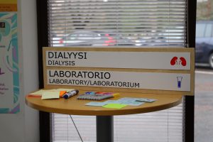
They pointed out that the signs were unclear, messy, and not easy to read for everyone, so people got easily lost in the building. Teams also pointed out that there weren’t any signs in English for foreign people.
The team came up with an idea about multiculturalism signs and since other people prefer visual effects instead of text (and another way around) they wanted to use symbols too. They started to work around that and created a new neutral sign, which took into consideration for example those who have impaired vision. They chose the material, which is easy to read, clean and long-lasting material. The plastic is matte, so it doesn’t shine and created examples from the symbols. Such a great project!
RIIHIKOTI
#1
Need: Development of the healthcare process. Nursing is quite usually physically immense, and the population is growing older. There is a need to find solutions to ease physical stress with technology. If we can replace two nurses with one + technology, it would mean substantial savings and makes receiving help more meaningful to those persons that are flooded with different nurses.
Order: Monitoring the daily operations of the staff. Tasks, where technology could assist the operations.
The team searched problems and they found out that handling medicine is problematic. There’s too much traffic in the room since there are also other things stored in the same space than medicine but also the medical notes are done in an impractical way. They first began to work with that and came up with improvement ideas:
- Distribution of medicine is solved with a trolley which has attached and locked computer for the medical information.
- The medical room will be locked with an electric lock that identifies the nurse
- Hatch attached to the medicine room’s door, where someone gives the needed medicines for the nurses
This team continued working with the project so we are looking forward to seeing how they will develop these ideas!
#2
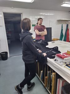
Need: Riihikoti has long corridors and that leads to a lot of transportation of goods and walking. Transportation causes problems with linen, food, and medical deliveries as time is directed away from the customer’s work. Linen and food deliveries take approximately two hours per unit per day. Riihikoti has three units, of which one is divided into four floors. The customer amounts are 45, 52, and 50. The staff amounts to 100 and in addition, there are some 40 to 60 daily guests.
Order: Product development together with the company. There is a need for linen (+ foods and medicine) transportation cart, which could be based on Pulu Robotics cart and to a cart based on VED EDR- development cart. Things to consider (Safety, using the elevator, usability, speed, locking, traceability, programming, service, and upkeep). What types of business opportunities does the cart have? What could be the best benchmark?
In the Halfway gala, students presented their idea to solve the problem: a 3D model from a service cart, which helps to move the carts around and offers easy access to information for nurses from the computer
K-HKS (Kanta-Häme central hospital)
#1
Need: K-HKS Emergency lobby has a lobby which situation might not correlate with the operation rooms. That is a problem for the customers in line, as there are no clear signals on how long the waiting might take. Could the process be mapped to the extent of the depth in that the information would available also in a public source so that the customers that are coming to wait could see it?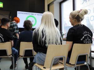
Order: A visual tool to clarify the situation of the ”traffic” of the waiting in the ER, for instance with color-coding. Cutting down the waiting time with some guidance tools. Creating the best waiting experience as possible. In the background is also the need that the healthcare district would need the information to use to their advantage. In the future, it’s also a possibility to use AI to map the potential customer flows.
Students created a visualized solution for the waiting time. They used traffic light colors, which are familiar to many people. Waiting time color codes: green 0-2h, yellow 3-4h, red more than 4h, and they are visible for everyone. This way patients know the situation all the time and the waiting time is more comfortable.
#2
The emergency room waiting process is under change. Waiting now describes the time a customer is spending in the ER lobby. In addition to the time spent in the lobby there would also be a time before arriving at the hospital and possibly the time after the operation.
Order: How could the ER process be optimized so that it could provide as much beneficial information as possible. This process would also support the nursing staff and would simultaneously work as transparent as possible to the customer. How might the process be executed in the future?
Students created a blueprint from a selected customer process. They created the blueprint from the service and the points that can affect the quality of the service. They also looked at the blueprint from the eyes of the nurses and staff and all the things that can affect their work. Students also compared the situations of the customers and staff and what kind of effect would they have on each other.
Great start to our HAMK Design Factory journey !
PDP is part of Häme Design Factory project